TerraFuture: Community-Driven Environmental Nonprofit
Overview
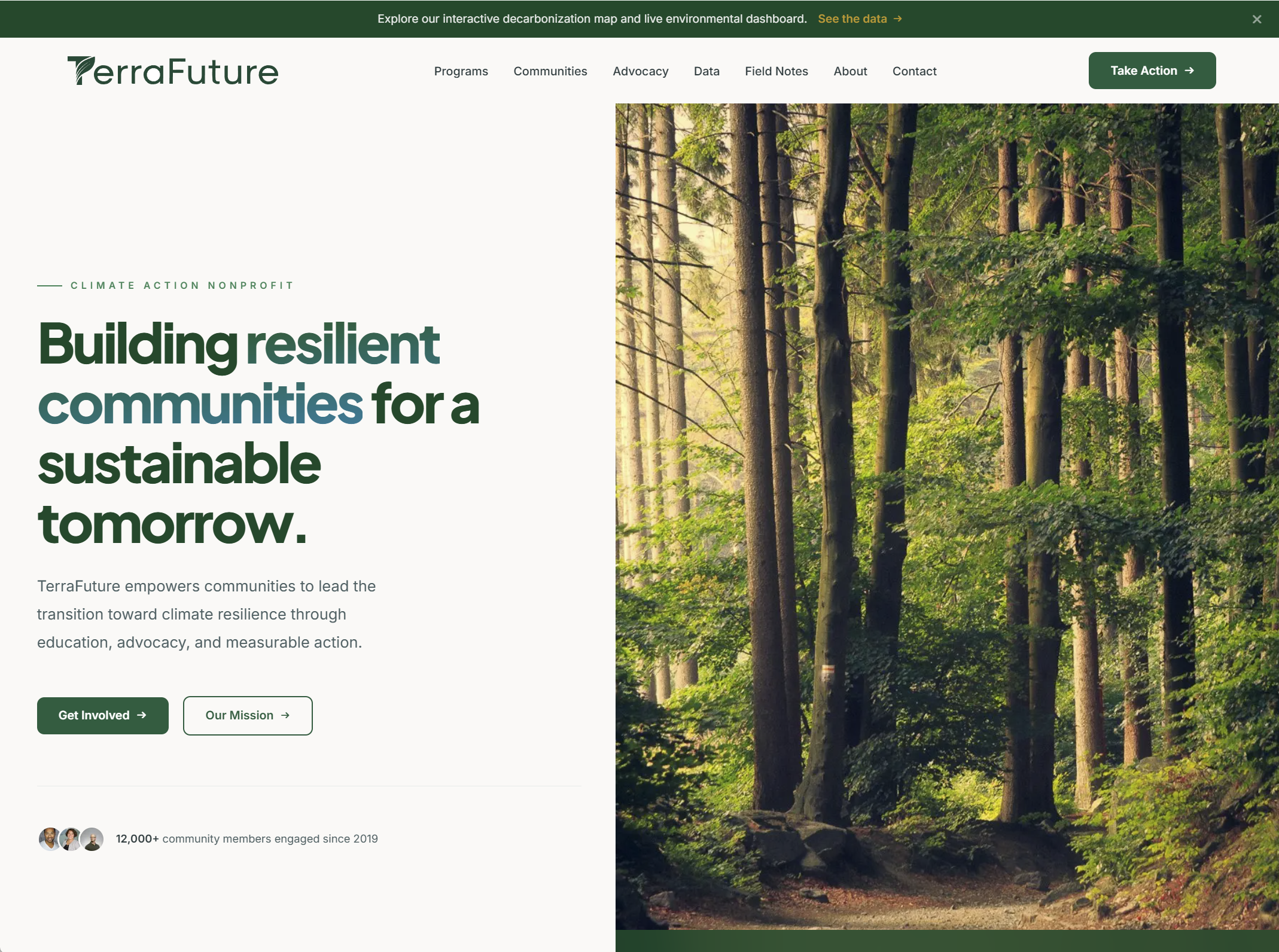
TerraFuture spans 47 neighborhoods, 140 environmental sensors, 18,500 trees planted, and 2.4 MW of community solar. Every one of those numbers was locked inside PDF reports that averaged fewer than 30 downloads per quarter. The organization’s data-driven identity existed everywhere except on its own website.
We rebuilt the site around the asset no peer organization can match: an interactive Environmental Data Dashboard. Air quality trends, tree canopy growth, solar generation, and CO2 reduction are now explorable in real time, with per-district drill-down and CSV exports for researchers and civic tech partners. Community voices, policy wins, and a proper press kit finally have a home, and the whole experience is mobile-first and accessible from day one.
The dashboard quickly became the most-visited section of the site, driving 340+ quarterly dataset downloads (up from 30), 200+ monthly developer visits, and a 300% increase in press inquiries.
TerraFuture’s greatest asset, its open environmental data, was invisible on its own site. The old platform was a static HTML build with no CMS, no component system, and no mobile strategy. Every content update required a developer.
- Sensor data, canopy measurements, and CO2 metrics locked inside PDFs nobody downloaded
- No interactive visualizations, despite a 140-sensor network publishing real-time data
- Generic stock photography that could belong to any environmental organization
- Policy wins, partnerships, and coalition work buried in body copy
- A broken mobile experience for the community members who use phones as their primary device
- No press kit, no media contacts, and no accessible path for journalists
We rebuilt the site as a modern, data-forward platform that leads with the evidence behind the mission.
- Interactive Environmental Data Dashboard with air quality, canopy, solar, and CO2 visualizations
- Community Resilience Index display with per-district scoring and methodology documentation
- Open API section with code examples, CSV exports, and researcher-friendly documentation
- Dedicated advocacy page tracking policy wins and active campaigns
- First-class community stories featuring real voices from 47 neighborhoods
- Full press kit with downloadable logos, fact sheets, and spokesperson contacts
- Mobile-first, WCAG 2.1 AA accessible, with accessible chart alternatives throughout
See the Live Site
Visit the live site to see how we put these decisions into practice.
View Live SiteReady to Build Something Great?
Let's discuss your project and see how we can help your organization achieve its goals.
Start a Project