BridgeWorks: Workforce Development for Returning Citizens
Overview
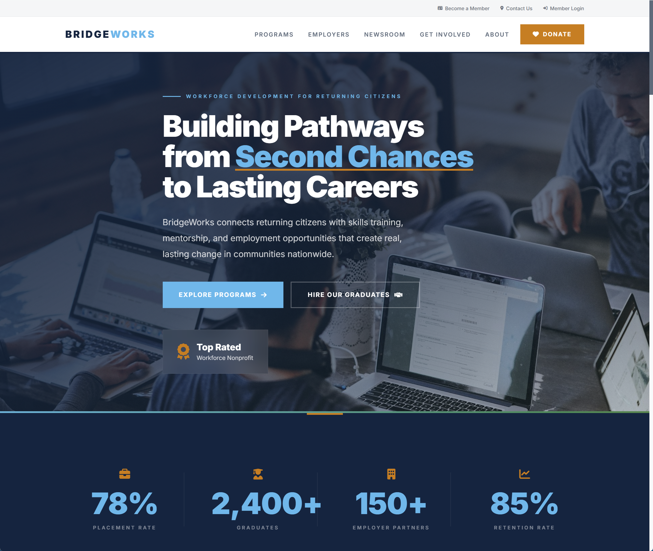
BridgeWorks connects returning citizens with skills training, mentorship, and employer partnerships that produce sector-leading outcomes: 78% job placement, 85% one-year retention, and recidivism rates a fraction of the national average. Their website did not reflect any of it. Years of neglect, a dated theme, and a broken mobile experience had left the organization with a digital presence that actively worked against its credibility.
We rebuilt the site from scratch around the four audiences that matter: participants, employers, donors, and the general public. A bold navy-and-sky identity, parallax hero, animated stat counters, and a vertical process timeline guide visitors through the program journey. A dedicated employer section surfaces the ROI data (WOTC tax credits, turnover savings, time to productivity) that previously required a phone call, and an impact-tied donate flow connects every gift to a concrete outcome.
The result is a platform that finally matches the quality of the work, and the numbers reflect it: mobile engagement up 142%, donor conversion doubled, and Lighthouse scores above 95 across the board.
Years of compromises had left BridgeWorks with a site that undermined an organization with sector-leading outcomes, CARF accreditation, a National Reentry Resource Center Award, and a $3M U.S. Department of Labor grant. The team was competing for participants, employers, and donors while the website worked against them.
- An outdated WordPress theme that had not been meaningfully updated since 2019
- A broken mobile experience for the 68% of prospective participants arriving on phones
- No clear next step for any visitor, with the donate button buried in the footer
- Program details scattered across blog posts and PDF attachments
- No employer-facing content, despite partnerships generating $850,000 in annual revenue
- Slow load times, no analytics, and no way to measure what was working
We designed and built a new site from the ground up, with audience-specific journeys and the polish of a modern consumer product.
- Parallax hero and animated stat counters that lead with the outcomes donors and employers care about
- Vertical process timeline walking prospective participants through Apply, Train, Connect, and Thrive
- Tabbed employer section surfacing ROI, tax incentives, and partnership benefits without a sales call
- Impact-tied giving levels and recurring donations through a named donor circle
- Mobile-first responsive design that treats the phone experience as the primary experience
- WCAG 2.1 AA accessibility built in from day one, not bolted on after launch
- Full analytics and conversion tracking so the team can measure and improve
See the Live Site
Visit the live site to see how we put these decisions into practice.
View Live SiteReady to Build Something Great?
Let's discuss your project and see how we can help your organization achieve its goals.
Start a Project