The Reading League: Science of Reading Homepage Concept
Overview
The Reading League is a national education nonprofit at the center of the science of reading movement, with 46 state chapters and a constituency that spans teachers, school leaders, families, researchers, and policymakers. Their RFP asked for a complete redesign against five goals: usability, accessibility, search visibility, conversions, and fundraising, and it asked the agency to apply and extend the existing brand rather than reinvent it.
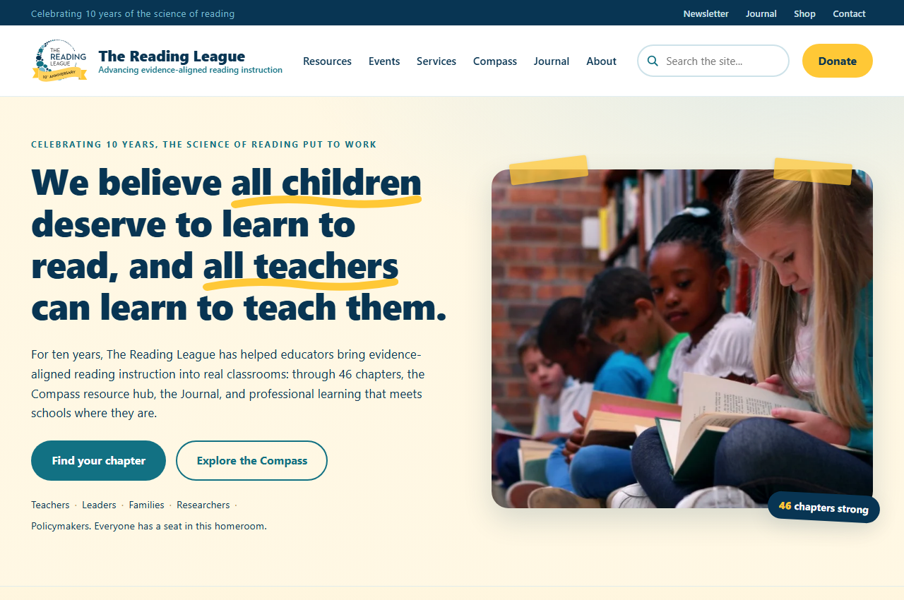
We built a single, self-contained homepage concept that reads as The Reading League elevated, not rebranded. The navy, teal, and gold palette and the ten-year anniversary mark were sampled directly from the organization’s own live site and logo files, then applied to a warm, homeroom-framed homepage: a mission-forward hero, clear pathways for each audience, an interactive chapter finder in place of the current static map, a resource-hub search teaser, and a persistent Donate call to action in the header and footer.
The concept demonstrates exactly the skill the brief asked for: extending an established identity with discipline, designing audience-first information architecture, and treating accessibility as a first-class constraint rather than a final audit.
The Reading League had earned national authority on evidence-aligned reading instruction. Their homepage did not carry it. The brief was demanding, and the evaluation rested entirely on the written proposal and concept, with no brand guide supplied and no mockup required.
- A condensed menu that hid the paths each audience actually needed
- A static map graphic standing in for a distributed 46-chapter network
- Resources and the Journal that were present but hard to discover
- A brand to honor and extend, using approved fonts and colors, with no brand guide provided
- Accessibility to WCAG 2.2 AA required across the experience
We delivered a single-file homepage concept that extends the brand and puts each audience on a clear path.
- Brand extension from first principles, with palette and type derived from the organization’s existing assets
- Audience-first navigation for teachers, leaders, families, researchers, and policymakers
- An interactive chapter finder replacing the static map for the 46-chapter network
- A resource-hub search teaser for faceted discovery of guides and tools
- A persistent Donate call to action in the header and footer, plus a newsletter journey
- WCAG 2.2 AA contrast, visible focus states, generous target sizes, and reduced-motion support built in from the start
- A self-contained build (one HTML file plus a local assets folder) that renders offline with no CDN or external fonts
See the Design in Action
Explore the full design concept and see how we approached solving the challenges outlined above.
View ConceptReady to Build Something Great?
Let's discuss your project and see how we can help your organization achieve its goals.
Start a Project